医院建筑设计丨医院建筑设计和布局(上)
时间:2022-05-17 作者:bird 浏览:

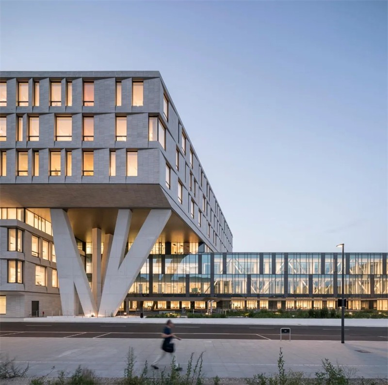
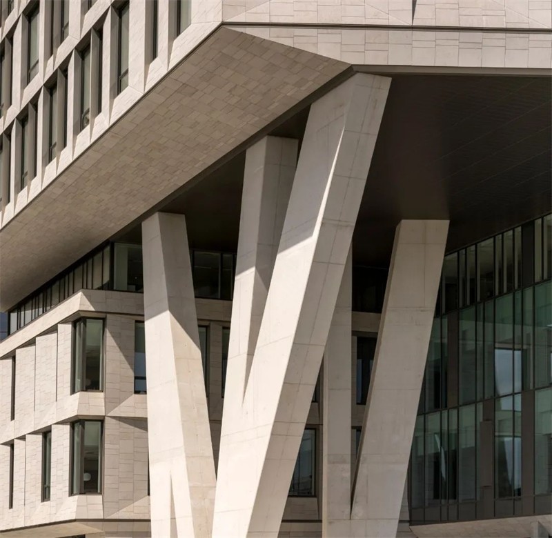
Rigshospitalet北翼有200多个病房、手术室、一个重症监护病房和门诊部。
设计的指导原则是病人的健康和康复,保健专业人员的需要,以及医院功能的未来适应性。
Rigshospitalet的新北翼扩建旨在鼓励每个病人的康复,同时优化医院工作人员的效率和功能。
Text description provided by the architects. Rigshospitalet North Wing features more than 200 patient rooms, operating rooms, an intensive care unit, and outpatient clinics. The guiding principles of the design are patient well-being and healing, the needs of healthcare professionals, and the future adaptability of the hospital functions. The new North Wing extension to Rigshospitalet aims to encourage the recovery of each patient while optimising the efficiency and functionality of the hospital staff.

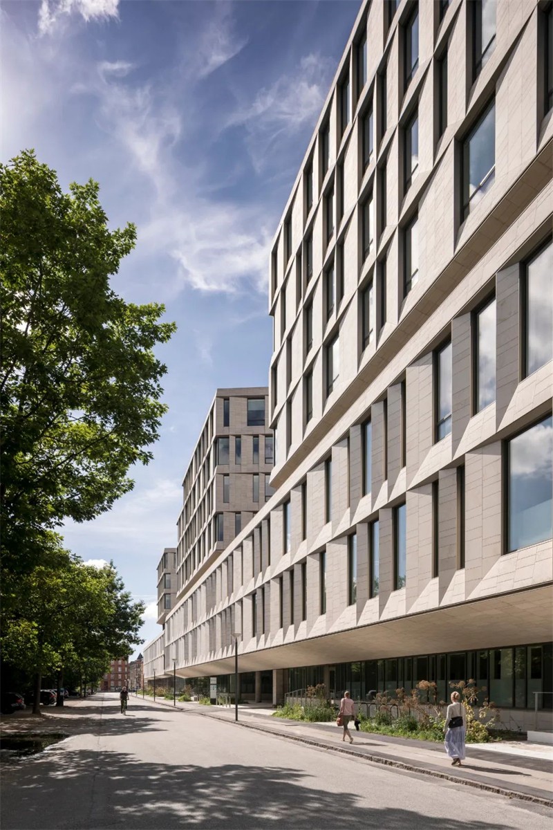
新侧翼有七层,共209个病房(196个是带有私人浴室的单间),33个手术室,一个重症监护病房,门诊诊所,诊断成像功能和研究空间。
北翼的设计和布局是LINK arkitektur和3XN以及Sweco工程公司密切合作的结果。
该项目的其他贡献者包括景观设计师Kristine Jensen Tegnestue和德国建筑师事务所Nickl & Partner。
The new wing is spread out over seven floors and offers a total of 209 patient rooms (196 are single rooms with private bathrooms), 33 operating rooms, an intensive care unit, outpatient clinics, diagnostic imaging functions, and research spaces. The design and layout of the North Wing are the results of a close collaboration between LINK arkitektur and 3XN, as well as the engineering firm Sweco. Additional contributors to the project include the landscape architect Kristine Jensen Tegnestue, and the German architect firm Nickl & Partner.

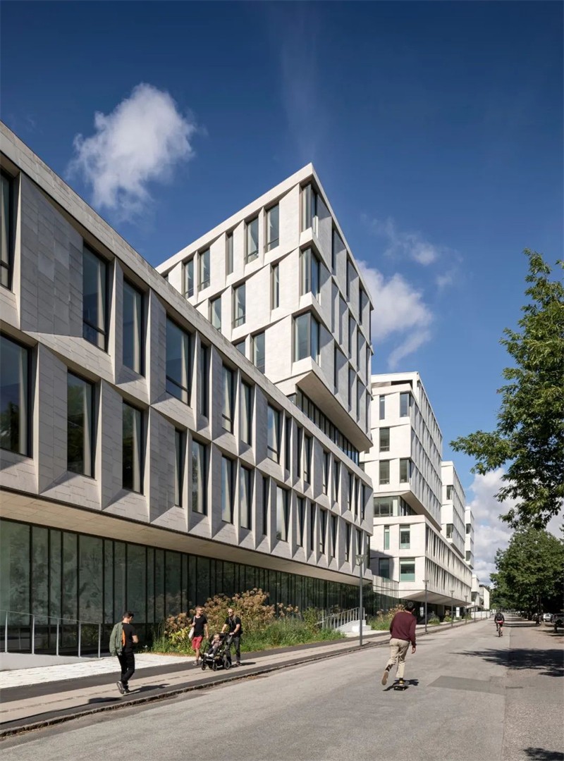
优化医院内部的流程,受心电图上线条的启发,北翼呈之字形,与贯穿整个机翼的主要“动脉”路线相交。
笔直的中央走道让员工可以轻松地从建筑的一端走到另一端,而周围的曲折结构意味着安静区和病房远离中央走廊,避免不必要的干扰。
因此,锯齿形的形式有许多用途:它通过优化员工的循环路线来缓解医院的流动,同时为病人提供更多的舒适和尊严,使其远离繁忙的医院环境。
Optimising the flow within the hospital. Inspired by the lines on a cardiogram graph, the North Wing is shaped like a zigzag and is intersected by a main ‘artery’ route that runs through the entire wing. The straight, central walkway allows staff to navigate easily from one end of the building to the other, while the surrounding zigzag structure means quiet zones and patient rooms are located away from the central corridor, avoiding unnecessary disturbances. The zigzag form thus serves numerous purposes: it eases the flow through the hospital by optimising the staff’s circulation routes while offering patients more comfort and dignity to recover away from the busy hospital environment.


清晰和容易的导航。病房和门诊部分布在三层,由一个连续的轴线连接。
到达区为日间患者进行了优化,而术前和术后区域被放置在手术区域的旁边。两个螺旋楼梯和四个中央电梯塔连接楼层到中央公共区域。
楼梯位于开放的中庭,日光从玻璃天花板和立面的大玻璃部分进入建筑。
公共等候区与每层的两个楼梯相连。为了帮助定位,每一层都有自己专用的色彩方案应用到门、地板和选定的墙壁上。
Olafur Eliasson、Malene Landgreen和Erik A. Frandsen的艺术作品为建筑带来了色彩和活力,软化了传统无菌的医院环境。
在中庭展示的艺术作品被巧妙地放置以让尽可能多的人欣赏,包括从外面路过的行人。
Clear and easy navigation. Wards and outpatient clinics are laid out over three floors and are connected by a continuous axis. Arrival areas are optimised for day patients, while the pre- and postoperative areas are placed next to the operating areas. Two spiral staircases and four central elevator towers connect the floors to the central common area. The staircases are located in the open atria, where daylight flows into the building from the glass ceiling, as well as through large glass sections in the façade. Common waiting areas are established in connection to the two staircases on each floor. To help orientation, each floor has its own dedicated colour scheme applied to doors, flooring, and selected walls. Artworks by Olafur Eliasson, Malene Landgreen, and Erik A. Frandsen bring colour and life into the building, softening the traditionally sterile hospital environment. The artworks exhibited in the atria are strategically placed to be enjoyed by as many people as possible, including passing pedestrians from outside.

